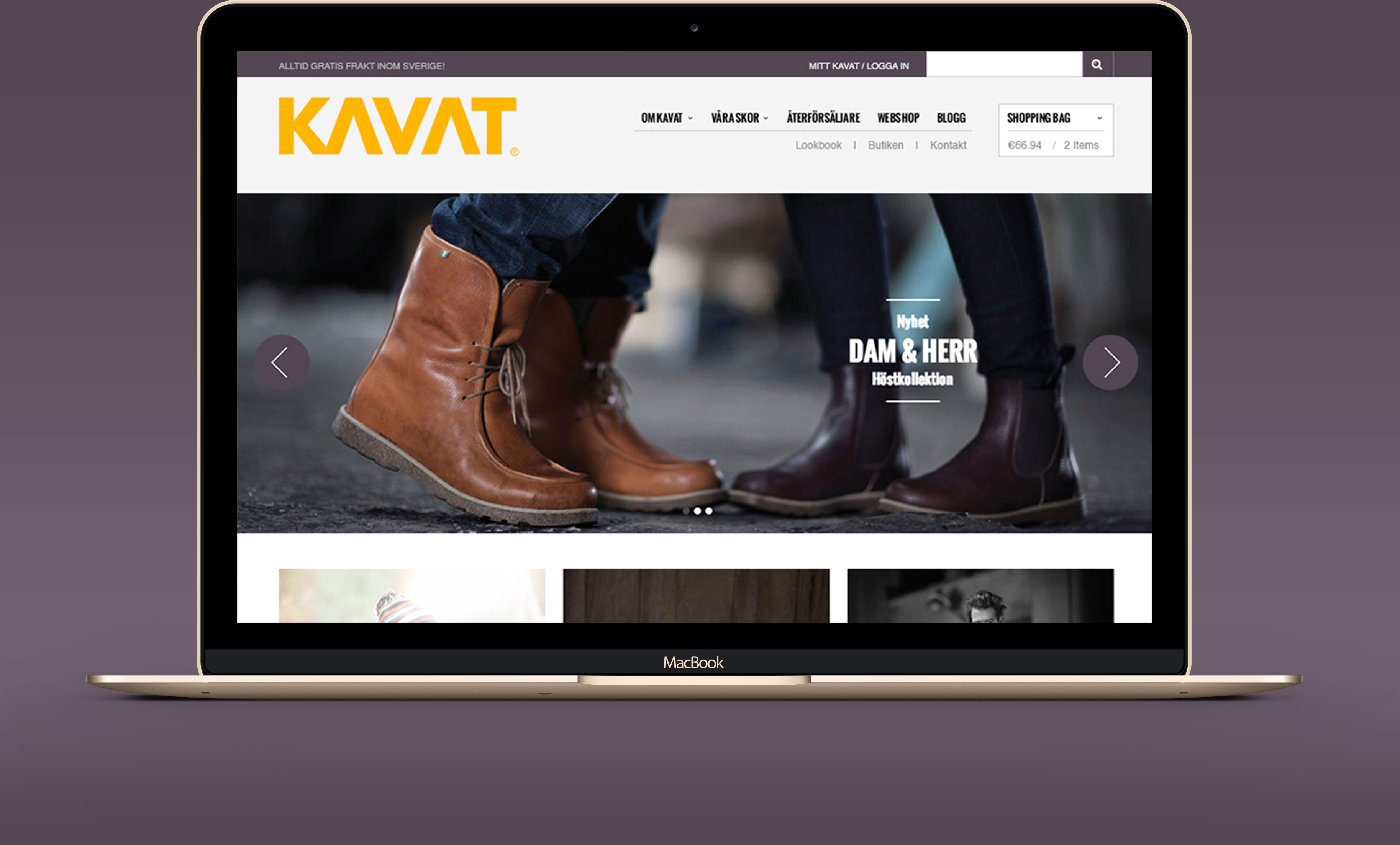
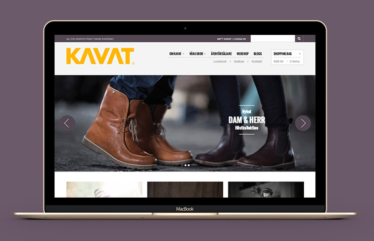
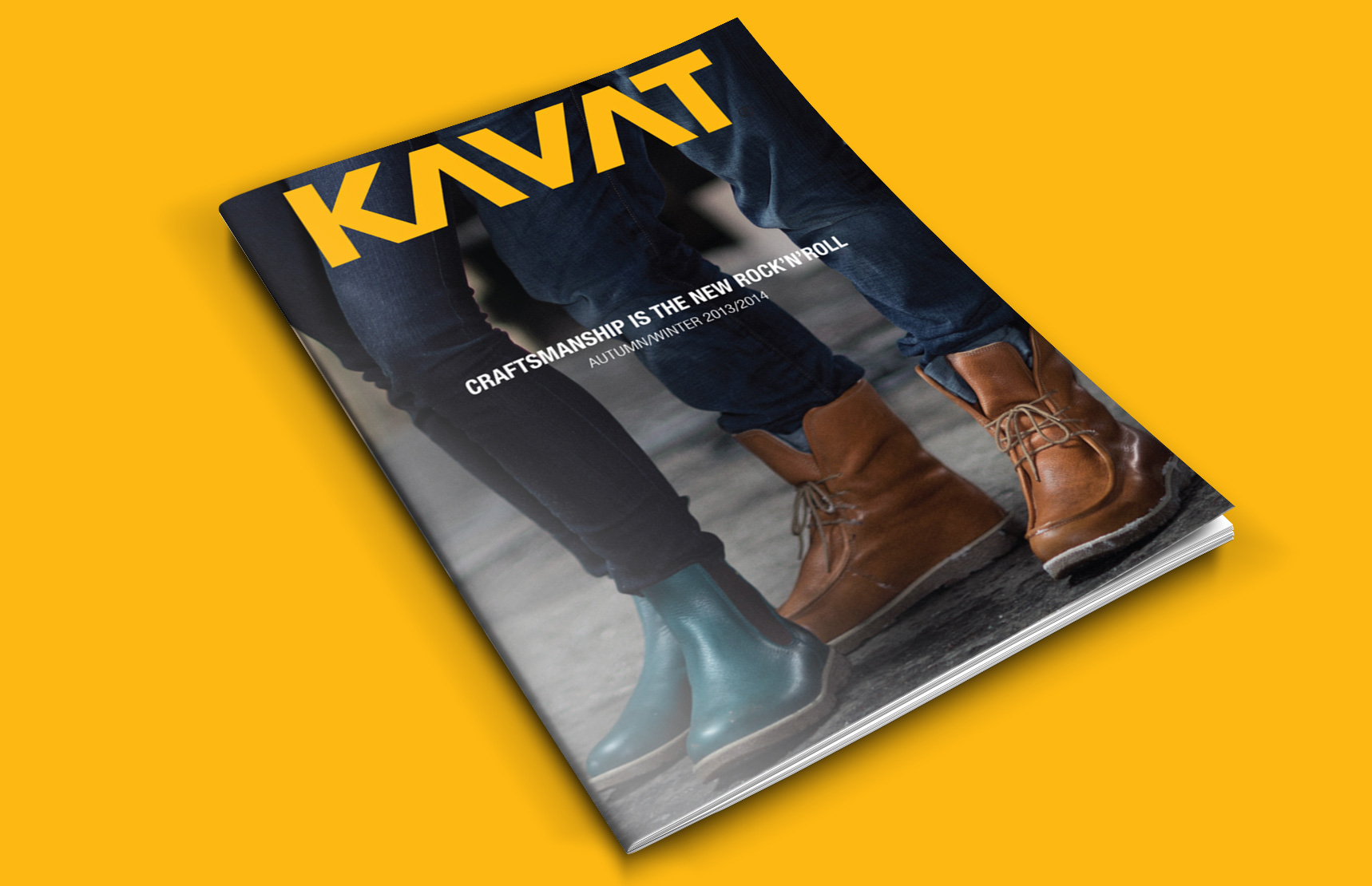
Kavat launched their first collection of adult shoes in fall 2013. With that and the new branding, Kavat wanted a new website that would attract both the old and the new target groups.
Brief
To create a new website that will attract both the old and the new target groups. It should be easy to navigate and the webshop should be the focus.
Process
We started the project with a kick-off meeting in Kumla, where Kavat has its HQ. In this meeting was also a person who represented the platform where the webshop would be built. We talked about the navigation, the webshop and the rest of the site that would be built on a WordPress theme.
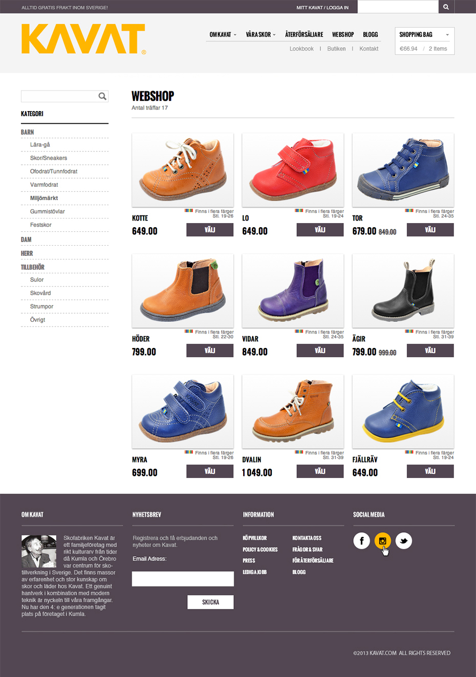
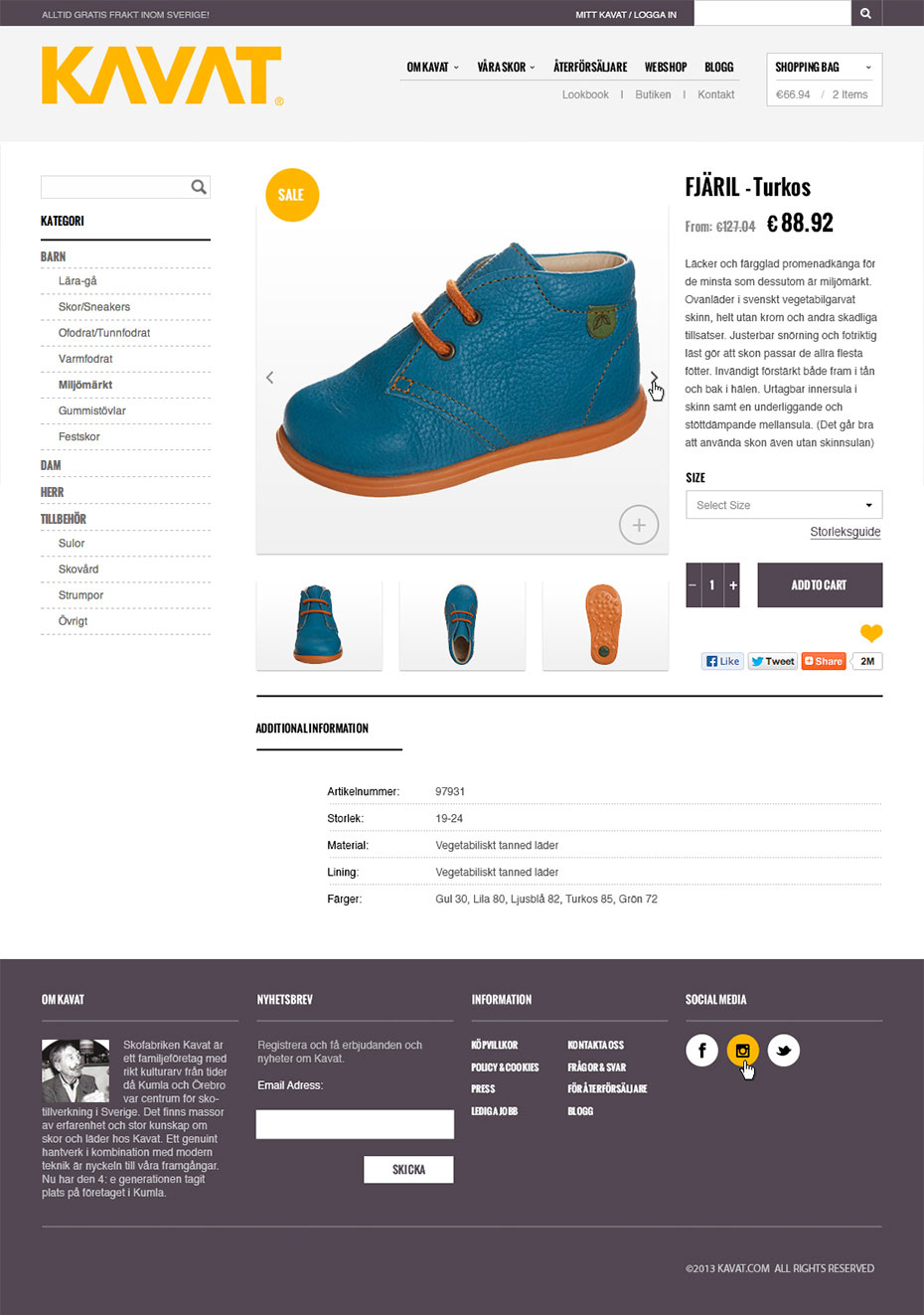
First I found the theme that the new Kavat website would be based on. I designed the landing page for Kavat to approve, then I moved on to design the different pages for the webshop, that would be programmed by ProClient based on the platform of Pyramid. Pyramid isn't that flexible with their functions, but after a few rounds of feedback I was able to design the pages so both the client was happy and the programmer knew it was doable.
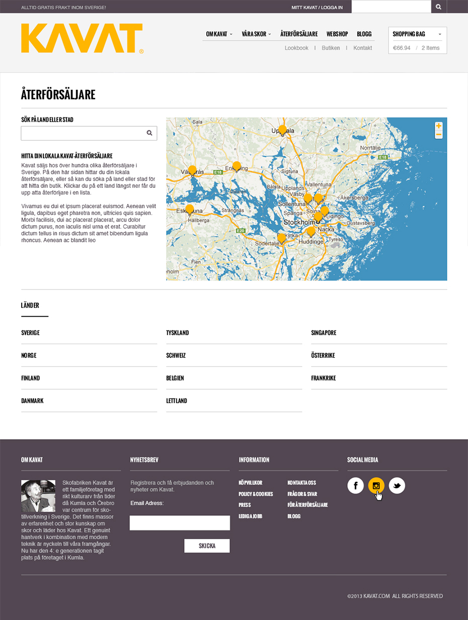
One of the pages on the new website that also got a real makeover is the Retailers. Before it was just a list, and it was very hard to find a store close to you. I designed this page to include a map and a search function. After a search is done, there is a list next to the map and it is very easy to locate the stores on the map.
Challenges
One of the challenges was to create the design for the webshop, since only the CSS could be changed on the Pyramid platform. But with good communication, the programmer and I could talk about the different functions in Pyramid and with that information the design came through looking great.
To make sure the photos for the pages Shop Collection and Made to Measure would fit and be the way we wanted the to be, the design director and I overlooked the Bespoken F/W 2011 photo shoot. This was fun, and also really nice to get to know the guys behind the brand a lot better.
